 0412 267 639
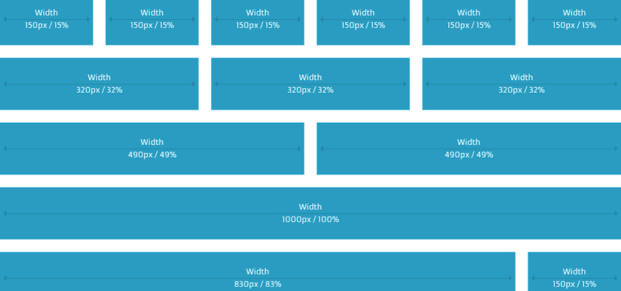
A web design layout grid will provide the column sizing so that web elements can be represented consistently throughout the design. Web design grids are considered to be one of the fundamental staples of bespoke web design.
Design grid layouts are great because:
- Grids establish a consistent look - The main purpose of a grid is to establish a set of guidelines for how elements should be positioned within a layout. The consistency of a layout is an important part of making the content accessible, as it helps the user to understand where to find the next piece of information within the layout. It sets expectations and defines the rules
- Grids provide a foundation and balance - Grids exist primarily to help determine the position and balance of a layout. This can be used to help ensure that content is presented in an easy-to-understand order and can also be used to highlight specific areas of content simply by breaking elements outside the grid. The user will naturally identify these break-outs and be drawn towards them, giving the designer the opportunity to play with the hierarchy of a layout and tweak the semantic meaning of a piece of work
- Grids keep your content well organised - One of the main uses for a grid is to keep your elements aligned and ordered and your page design clean and neat. This is because grids encourage alignment. By establishing a grid system, you are creating a set structure for yourself to align elements against, and in doing this, you can create for yourself a neat, clean, and organised layout.
- Grids make you web design work easier - Grids can greatly speed up and improve your design time, as they can act as a guide that signals where is best to place, position, and scale elements. Instead of randomly positioning elements until you find a decent looking composition, a grid should help guide you toward a natural solution
- Your font will thank you - If nothing else, grids and type are two design elements that very happily go hand in hand. A strong grid can help make type-heavy layouts appear neater, more organized, and can help to enhance the legibility and readability of content
- Grids make your layout less cluttered - Grids are a fantastic tool for ridding your design of the dreaded cluttered effect, particularly when that’s not the effect you were going for. They do this by employing the use of margins. Margins are, by very basic definitions, the space around your design. Generally speaking, the tighter your margins, the tenser and more cluttered your design can look, but the more open your margins, the neater and cleaner your design looks
- Grids are really flexible - All grids are highly functional and flexible things and can adapt to changing designs. When creating a grid, you have the choice of as many columns as you like which is what makes grids flexible. The number of columns is totally up to you, but the more columns you have, the more flexible your design will be, and the fewer, the simpler and less flexible it will be
- Grids encourage white space - Are you designing a very white-space-heavy designed website? Grids can help you out with that, too. When you’ve divided your design up into your desired amount of columns, place your necessary elements, but keep some rows and columns empty, leave them to simply be filled by white space. Grids provide the proportions you need to make your website have more white space
- Grids make it easier for your visitors to read your content - Grids can also help your type by encouraging more easy to read layouts. You see, the eye is very picky about line lengths for bodies of type. If lines are too long, they become harder to get through, and if they’re too short they seem too choppy and broken for us to immerse ourselves into. Generally speaking, the golden line length for type is a minimum of six words per line and a rough average of about 50-65 characters (including spaces) on each line.
Comments