
Colour selection and other visual elements on your website will influence whether your visitors will stay on your website or quickly leave. The color scheme you use on your website can engage and keep visitors on your website and get them to purchase your products or services or not. Colour is also important to make your website accessible.
Colour Psychology
Colour has a lot of sway on our emotions and attitudes. Colour psychology is the science of how color affects human behavior. It takes about 90 seconds for a person to form an opinion about a product. Over 50% of that opinion is based on the colour of the product. It makes sense that the colours of a website affects conversions. The bottom line is: use the right colours and you win.
| Colour | Positive Meaning | Negative Meaning |
|---|---|---|
| Red symbolises passion, love, courage, confidence, strong-will, spontaneity, honesty, and extroversion. Stimulates the appetite, by increasing metabolism | Symbolises danger, fire, blood, war, agression | |
| Orange is percieved as happy, enthusiastic, sociable, energetic, sporty, self-assured, and constructive. Currently used for a lot of sites | Attention-seeking | |
| Yellow can symbolise optimism, good-humour, confidence, practical, and intellectual | Can also symbolize dishonesty, cowardice, betrayal, jealousy, deceit, illness, hazard | |
| Pink can symbolise femininity and youth. Also signifies inspirational leaders, kindly and just, humanitarians, self-sacrifing, visionary, creative, and strong mentally | Naivity, weakness | |
| Purple symbolises royalty, spirituality, passion and love. Also signifies intuition, idealism, fearlessness, practical, wise, and a truth seeker | Cruelty, arrogance, mourning | |
| Blue symbolises calm, peaceful, water, sky, harmony, caring, therapeutic, trust, confidence, tact, inspiring, cleanliness, caution and loyalty. Gives people energy. Safe color to use in design | Sadness, cold, depression, suppresses the appetite. | |
| Green signifies understanding, self-control, adaptable, sympathetic, compassionate, generous, humble, nature loving, and romantic. Also symbolises good luck and religion | Also symbolises jealousy, envy and misfortune. See colour-blind issues. Green is not considerd a good colour for packaging. | |
| Brown is neutral, earthy, outdoors, warm | Dirty, dull. | |
| White is symbolic of cleanliness, innocence, space, purity, chastity, simplicity, peace, winter/snow, goodness, marriage/virginial | Death (in Eastern cultures), cold, clinical, sterile | |
| Grey /gray can be modern, intelligent, solid, clean. | Old age, sadness, boring, dull | |
| Black is associated with power, elegance, magic, mystery, night, sophistication, solid and powerful | Unhappiness, sadness, remorse, anger, witches (black magic), fear, evil, anonymity, mourning, death (Western cultures) |
How to Choose Your Colours
- Choose a palette of 4 colors to base the design (varying tones of the same colour can be used to highlight)
- Always use web safe hues for the main design elements, especially if these are going to contain any textual navigation
- Place your chosen colors next to each other in a graphics software program to see if they work together
- Think about the impression you want to give your visitors - do you want your site to look modern, fresh or corporate
- Place the chosen colors next to each other in a graphics software program to see if they >work well together
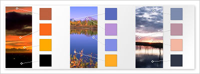
1. Look at colours in photos and magazines and in nature and replicate the colours that appeal to you
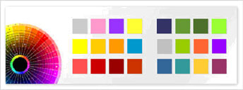
2. Play around with colours in a graphic design package to see what works well for your site

3. Take a more scientific approach and get software to choose the most complementary colours for you
Accessibility Considerations
- Colour blindness is an accessibility issue. Most colour blind people can't distinguish between shades of red and green. Shades of these colours appear lighter to colour blind people, but they cant see the actual differences in the two colours. Avoid using only red and green in your design
- Maintain a high contrast between text and background. This enables the text to be more easily viewed and read.
- Always put "alt" text on graphics so that screen readers can notify people using them, the purpose and the meaning of the image
Comments